Website Redesign
Food.com

About Food.com
Food.com is a website where people can find their favorite recipes over 500.000 dishes created by users called "Home Cooks".
Project Overview
Hungry for good food and great conversation? Grab a plate and join the fun!
Why this redesign?
This is a school project, and there is no interaction with the company and other related stakeholders.
The goal of this project was to design an intuitive product that is easy to use, efficient, and attractive.
Solo UX/UI Designer
Cross-platform Web App

Figma, Miro, and Photoshop
Website Redesign
Food.com
About Food.com
Food.com is a website where people can find their favorite recipes from over 500.000 dishes created by users called "Home Cooks".
Project Overview
Hungry for good food and great conversation? Grab a plate and join the fun!
Why this redesign?
This is a school project, and there is no interaction with the company and other related stakeholders.
The goal of this project was to design an intuitive product that is easy to use, efficient, and attractive.
Solo UX/UI Designer
Desktop & Web App
Figma, Miro, and Photoshop
Problem
Food.com is a famous recipe website in the US, but
-
The design does not help users find and save their favorite recipes smoothly.
-
Users did not know that Food.com is a social food platform where they can follow and interact with their favorite cooks; and
-
Users did not know they could upload their special recipes.
Solution
I based my design process on the Design Thinking methodology, which includes 5 stages: Empathize, Define, Ideate, Prototype, and Test.
Following the Mobile First strategy, I eventually created an interactive and responsive prototype for the mobile web where:
-
People who don't like cooking be able to easily find the recipe for their favorite meal;
-
Foodies find a variety of recipes, choose and cook the most appealing ones; and
-
Professional home cooks can follow other cooks, get inspiration for their future unique recipes, and upload the ones they are proud of.
Organizing my thoughts
In the beginning, I didn’t have a full understanding of the product. Therefore, I decided to conduct an in-depth analysis of the website first. I wanted to understand its functionalities, overall architecture, and navigation, as well as generate some initial ideas for improvement."

Website Analysis
Through the analysis, I was able to identify some clear usability issues and pain points. I listed all of them to validate them after my User Research:
-
The information architecture of the site is a mess.
- The User Experience is confusing, and there is no unified structure.
- It is difficult to understand the concept of its social food platform.
-
The UI looks outdated - It is disorganized and cluttered, with too many colors, which causes problems in legibility and readability.

The home page of the current version of the website.
Process
Empathize
-
Analyzing cooks' profile
-
User interviews
-
Usability test on the current website
-
User journey map
Define
-
User Personas
-
Point of view
-
How Might We
Ideate
Prototype
-
Paper sketching
-
Task & User flow
-
Low-Fi wireframes
-
UI Kit & Design system
-
High-Fi wireframes
-
Prototype
Test
-
Usability test
-
Iterations
1. Empathize
Understanding users
Since I did not have access to real users, I started to review cooks' profiles on the website. It helped me to have an initial view of one user category - those who regularly upload their recipes.
"Evan & I enjoy eating out at fine restaurants and then trying to re-create gourmet meals at home!"
"I cook, I write, and I eat. I have the best job ever!"
"I am at home in any kitchen and totally relaxed. Cooking makes me HAPPY. and I love to cook for others."
User interviews
I started my user research by conducting user interviews with 8 participants, who vary from daily active users to infrequent users for cooking, to define their "jobs to be done".
Interview questions were open-ended to understand users' motivation for using online recipes, sharing them, as well as their cooking journey.
I conducted some phone interviews, while some I ran in person. The male interviewees’ ages ranged from 24 to 35 years old, while all 4 females ranged from 27 and 32 years old.

To analyze the interviews, I ran Thematic Analysis in Miro to be able to categorize qualitative highlights said by potential users.
Key insights from interviews:
-
All of the participants used the "search" option to find their favorite recipe.
-
They chose their favorite recipe by selecting the one with the most appealing photo.
-
They wanted a clear list of ingredients and equipment to decide whether to cook it or not.
-
They used their mobile phones during the journey
-
They had been in situations where they forgot some ingredients while shopping.

An example of the Thematic Analysis
For privacy reasons, notes are not readable.
Usability testing on current version
After the user interview, I asked all of the participants to open Food.com on their mobile browsers and
-
Find their favorite food recipe
-
Save that recipe, and find it on the Save page
-
Add their own recipe
Key insights from the first usability:
-
It took ~8 seconds to find where they could start.
-
All of them used the search icon to find their recipe.
-
No one understood they could add their recipe.
-
One user quit the website after 30 seconds as they found the website overwhelming.
-
None of them understood they could follow the cooks.

A usability test with a foodie-type user
User journey map
Following insights from previous steps, I crafted a user journey map for the potential users to structure how they interact with the current website and what they might find helpful or frustrating.

User journey map
2. Define
Meet Robert, Angela, and Sophie
Having analyzed the interviews, I divided the user profiles for Food.com into 3 personas:
-
Robert, who doesn't like cooking! He only cooks to survive and spends less budget on eating outside;
-
Angela, who enjoys cooking and cooks on average 4-5 meals a week. She usually tries to cook new foods using online recipes, and
-
Sophie who is a professional home cook and gradually shares her recipes with people. She uses online resources to get inspiration, and also interacts with other cooks through tweaks and comments.

Robert

Angela

Sophie


Point of view
Now it was time to clear up my mind and define a problem statement that clearly and coherently explains what problem my design process aims to solve.
[Angela is a foodie who wants to cook a new food for the first time] needs [To have access to a recipe resource to easily find her favorite meal recipes and save them without creating an account] because [She wants to eat new homecooked healthy food and avoid spending too much money on eating out.]
"How Might We" questions
After defining the POV, I wanted to link what I had done so far with the ideation phase. Therefore I shaped "HMW questions" to reframe and open up my design challenge to inspire productive ideation step.


How Might We questions
After understanding the users' problems and needs, and crafting the "How Might We" questions, I went through several hours of brainstorming on how I could redesign the existing website to perfectly address users' concerns and also the business value proposition.
3. Ideate
Sketches
Having brainstormed ideas with myself and some peers, I started sketching out initial ideas for Mobile Web. These paper sketches were a quick and efficient method for visualizing the most important task of a user which is to find their favorite recipe.


Paper sketches
User Flow
Since the majority of users were Angela(s), to simplify the project, I put her at the heart of my design process and constructed Task Flow and User Flow, considering Angela's journey.


Task & User Flow
4. Prototype
Low-fidelity wireframe
Following up on the sketches, I started crafting low-fidelity wireframes in Figma, translating the sketches to a digital form, and preparing for early usability testing. My main goal at this stage was to design Angela's experience when trying to find her favorite "Beef Burger" on her mobile phone browser.
Next, I had a couple of iterations on the designed wireframes, and I ran 2 usability sessions to make sure it is the solution to users' needs.


Examples of Low-fi wireframes designed in Figma
UI Kit & Design System
Finally, I created a Design System to ensure that the visual design remains consistent in the design process.
To have a unified design, I used the Atomic Design method and:
-
Selected orange as the primary color to evoke the taste buds and grab attention. I used green as the secondary color to deliver a sense of health and nature.
-
Applied the Roboto Sans-serif typeface to follow the minimal design and deliver a joyful feeling.
-
Designed a responsive product and defined 3 grid systems for iPhone SE 2020, iPhone 13 Pro, and iPad Mini.
-
Choose round corners for buttons and inputs that illustrate the soft edges of foods.

My Atomic Design structure in Figma

High-fidelity wireframe
Next, I designed the initial high-fidelity wireframes to add color, images, and all visual elements in order to give the users a sense of a real product for the usability test.


Initial High-fidelity wireframes
5. Test
Usability test
After prototyping the initial wireframes, I set a couple of rounds of usability sessions with an overall of 9 users, and the following tasks were developed:
-
Find their favorite recipe
-
Save (share) that recipe
In order to evaluate the design, I asked users to complete tasks on the prototype using the Maze platform to be able to measure KPIs such as timing and touch heatmap.
Iterations
After each usability session, I iterated my design, and the major iterations are shown below:


Final High-fidelity wireframes
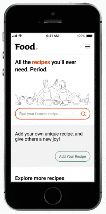
Food.com is a website where people can find their favorite recipes over 500.000 dishes created by users called "Home Cooks".
Home Page

Search pop-up

Result page

Recipe Page

Filter & Sort pop-up

Reflection
What I have learned from this project
I learned how to design an Atomic Design System from the scratch. Furthermore, I learned how to apply the "mobile first concept" when I have different platforms to design.
Atomic design system
As a business with a digital product grows, its digital platforms must evolve to support this growth. Using atomic design helps simplify the challenge of designing and updating digital assets by providing a structure to work in.
In this project, I learned how to design a complete design system using the atomic design method.
Mobile first concept
Following the Mobile First concept to design a responsive product, I put myself under a challenge and chose the iPhone SE, which has the smallest screen, to start.
I learned that mobile screens differ from desktops, which offer enhanced functionality in many cases compared to desktops.