About Mentobi
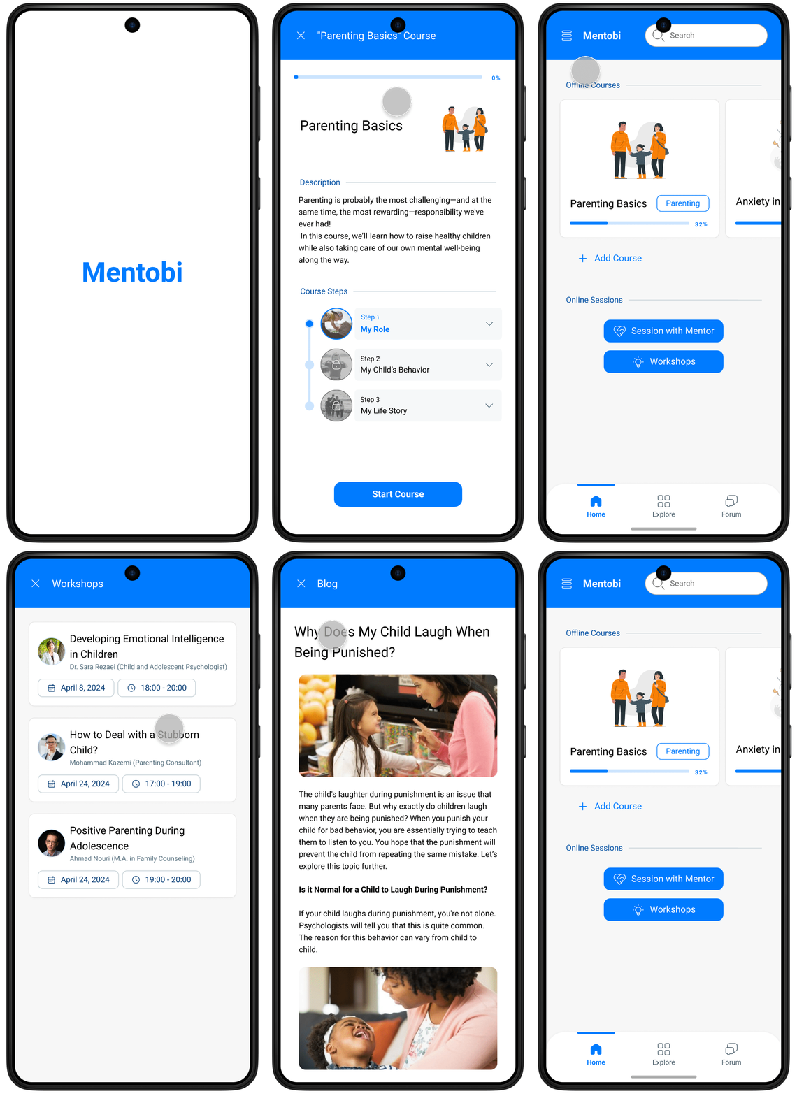
Mentobi is an intuitive and trusted parenting app designed to help parents make more conscious, informed decisions in raising their children. It brings together expert consultations, specialized workshops, and practical, science-backed content serving as a professional companion for parents throughout their journey of growth and discovery.
The app is available on Google Play and the App Store, and we’re currently collaborating with a branding team to develop its new brand identity. Version 2, reflecting the updated brand, will be released in Q1 2026.
Problem
Parents who have children below 9 years old need a reliable and accessible source that provides practical training and mentoring to be able to overcome their parenting challenges.
Solution
Our mentoring platform helps parents who want to enhance their parenting role and overcome their parenting challenges by providing accessible and affordable guided and tailored mentorship services to raise children.
Process
My design process followed the Design Thinking framework, but it wasn’t strictly linear. Each phase informed the next and often looped back as new insights emerged. I collaborated closely with stakeholders and developers throughout to align user needs with business goals and technical constraints.
Below, I’ve highlighted some key steps and outcomes from each phase.
1. Empathize
Stakeholder Interviews
In the beginning, we held the first meeting with stakeholders to understand the initial idea, and below are the key insights:
-
To build a digital product specifically for parents to help them in the field of parenting.
-
Currently, most existing products in the market are not good enough to adequately address parental needs. They are academically oriented and not pragmatic.
-
Existing products are usually direct translations from non-Persian resources, where they have not paid attention to the cultural and ethnographical differences.
User Interviews
To start looking at the problem from the users' perspective, we interviewed 12 parents from different demographic backgrounds, both in-person and virtually.
We used an open Affinity Diagram to organize our interview findings and identify recurring patterns. This process helped us uncover parents’ key needs and pain points, which we grouped into six main themes:
-
Parents’ behavior in using the internet and digital devices.
-
Parents’ prior initiatives for personal and parental improvement.
-
Characteristics of high-quality education from the parents’ point of view.
-
Parents’ opinions and actions regarding counseling and mentoring.
-
Parents’ mental and physical challenges in everyday life.
-
Parents’ relationships with their spouses and children.
2. Define
User Personas
Leveraging insights from our research, we created three representative personas to guide design decisions and keep the product aligned with real user needs.
We used a spectrum template to develop personas, ensuring we captured a complete picture of users’ demographics, motivations, and behaviors. This helped us clearly define distinct parent types and understand how their goals and challenges varied.

Challenge Statement
After analyzing the interview findings and defining our user personas, we identified one core challenge to align the entire team around a shared goal:
How might we help parents access practical, culturally relevant guidance and mental health support that fits their daily routines and financial realities so they can feel more confident and effective in raising their children?
3. Ideate
Crazy 8's
At this stage, we turned our research insights into early design ideas. Using the Crazy 8’s method, each team member sketched eight quick concepts in eight minutes to explore different ways to address our personas’ needs.
We then reviewed and discussed all sketches, combining the strongest ideas into a single direction. This process helped us align on an initial UX concept for our solution.


Initial Usability Testing
To validate our early concept, we conducted usability interviews with seven parents who closely matched our target personas. We presented our initial sketches and walked them through key interactions, asking for their impressions and honest feedback.
At the end of each session, participants were invited to complete a short commitment form to gauge genuine interest in using the product.
Results:
Five out of seven participants expressed a strong interest in using the product, confirming that the concept resonated with parents and giving us confidence to move forward with the idea.

Site Map
To establish a clear information architecture, we created a site map that outlined all the key pages and their relationships. This helped us visualize how users would navigate through the product and ensured that content and features were organized logically around user goals.
We started by grouping features and content from our research insights, then mapped them into primary and secondary navigation levels. The final site map served as a blueprint for designing intuitive user flows and defining the overall structure of the app.

4. Prototype
(App version)
High-fi Wireframes
Home Page


Forum Page

A Parenting Course Page


